
What will the future yield? Part II: Not all superheroes wear capes
6 minute read

We use many metrics and ratios to quickly distil complex financial performance data so that they can be easily understood and acted upon. One of the most frequently-used in equities is the Cyclically-Adjusted Price-to-Earnings Ratio (CAPE). This variant of the ubiquitous Price-to-Earnings Ratio (PE) was proposed by Nobel Prize winner Robert Shiller in 1988. It is defined as price divided by the average of ten years of earnings, adjusted for inflation. This is supposedly is a better guide to a company’s potential earnings relative to its stock price than the standard PE ratio.
Strictly speaking, CAPE is not a predictor of future stock price movements, nor is it a comment on a stock’s fair value in the truest sense. But it is a hugely useful indicator for quickly and simply understanding when a mean-reverting market feels over/underpriced.
As the inflation/interest rate cycle moves into a new stage, it is the opportune time to explore whether CAPE can be applied to real estate. This is Part II of an article (see What will the future yield? Part I: Pricing in rental growth).
“You talk pretty tough for a guy in a cape”, X-Men: The Last Stand
It was several years ago when reading up about the use of CAPE in equities that it first occurred to me that this ratio could work for real estate. I was delighted when my calculations aligned with the theory, and sensible results ensued. I have been tracking CAPE ever since.
I was then somewhat disheartened when, a little while later, I came across a 2015 white paper from the Investment Property Forum (IPF) entitled What is Fair Value? which calculated a CAPE for UK real estate. As an avid reader of the IPF’s studies - and indeed chair of its Research Steering Group from 2018-22 - I would have surely read this paper at the time. I must have forgotten about it, filed it away in my subconscious, only for it to re-emerge years later masquerading as original thought.
That said, the fact that this useful metric had not been more widely adopted by the industry since the IPF study does suggest that something was amiss. Either CAPE doesn’t work (which it does) or it is not intuitive to real estate professionals (which it isn’t).
I then had my second (but apparently first original) Eureka moment; the real estate industry does not talk in ratios as the equity market does, but it does talk in yields. And what is a yield if not an inverted PE ratio? I chose to flip the CAPE into an inflation-adjusted net initial yield and haven’t looked back since1.
“I always try to adjust to the situation”, Novak Djokovic
The chart below highlights how UK All Property inflation-adjusted yields were noticeably lower than nominal yields during 2014-19, as the higher inflation from the previous period (2009-13) reduced income in real terms. This made real estate feel more expensive than was perhaps reflected by the nominal yield.
The recent bout of extremely high inflation reveals another interesting trend. One would have expected this period to have reduced income in real terms far more substantially, proportionately lowering yields further. Well, indeed, but this was then more than offset by the commensurate rise in nominal yields - themselves reacting to the higher policy rates at the time.
The result was that inflation-adjusted and nominal yields ended up being broadly equal to each other. In fact, as at mid-2024 when I ran this analysis, inflation-adjusted yields were slightly higher. This is positive news for those investors keen to buy into the market at this point of the cycle but who are perhaps concerned about the impact of inflation on future corporate earnings.

“It is better to fail in originality than to succeed in imitation”, Herman Melville
Then there is the obvious riposte:
“Wait a minute, we have this heuristic already. When nominal yields are at a cyclical low, we would expect them to increase at some point. We don’t need to adjust yields by inflation to tell us the same thing.”
And, of course, you’d be right. So my benchmark for practical usefulness is whether the inflation-adjusted yield does a better job than the nominal yield of anticipating a market reversion in values.
To do this, I ran two statistical tests; Confusion Matrix and Receiver Operating Characteristics. I do not like to get too technical in my blog, as that is not what many readers come here for, so I will restrict this next section to high level commentary only.
“You must have me confused with someone else”, Airplane!
First, I calculated the probability of the UK All Property yield level at any point in time equating to the average annual capital value growth over the next five years turning negative. In other words, how likely is it that the yield coincides with values reverting downwards to a cyclical mean during the next stage of the cycle?
The results were translated into in a Confusion Matrix; a table used in statistics and machine learning to evaluate the performance of a classification model. I compare the actual target values with the model’s predictions, for each decile of probability. Honestly, it sounds more complicated than it actually is:
True Positives, where a correction in values was predicted, and this transpired (i.e. values fell)
True Negatives, where no correction in values was predicted, and this transpired (i.e. values did not fall)
False Positives, where a correction in values was predicted, but this did not transpire (i.e. values did not fall)
False Negatives, where no correction in values was predicted, but this did not transpire (i.e. values fell)
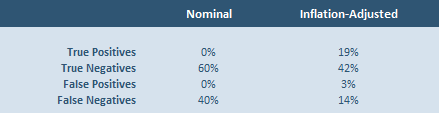
The table above shows the results at the 50% probability level. From this we see that the inflation-adjusted yield comfortably outperforms the nominal yield, especially as it records more True Positives, which is the principal signal we are looking for. As it turns out, nominal yields produced a lot of False Negatives.
“Are you receiving me?”, The Martian
Despite the encouraging result from the Confusion Matrix, there is little point in an indicator working if it gives as many False Positives as True Positives across all the probabilities, i.e. from 10% to 90% likelihood. This type of situation resulted in the famous quote by MIT Professor Paul Samuelson:
“The stock market has predicted nine of the last five recessions.”
I therefore compare both the nominal yield and the inflation-adjusted yield on these two metrics using the Receiver Operating Characteristics methodology. A strong performance on the chart below would be represented by a vertical line; as probabilities increase, we see an increasing number of True Positives but no more False Positives. Conversely, a poor result would be represented by a horizontal line on the chart. Once again, it is clear from my analysis that the inflation-adjusted yield outperforms the nominal yield, particularly where the probabilities of being correct are high.
We can state this another way; by measuring the size of the area below and to the right of the line. This is called the Area Under the Curve, where the higher the percentage the better. On this metric, the nominal yield scores 71%, while the inflation-adjusted yield achieves 74%.

As useful as heuristics are, they can also be dangerous when promoted too heavily, especially without context and further analysis. And I reiterate that the inflation-adjusted yield should no more be relied upon for forecasting than the nominal yield (i.e. not at all). To make this point, by my calculations, the Area Under the Curve percentage for the much vaunted PMI indicator as a predictor of near-term GDP growth is a more impressive 86%. That should be the standard we aim for in predictive analytics of this nature.
Nonetheless, if anything can improve our understanding of yields and cycles - particularly during periods characterised by inflation - and in an intuitive fashion - then it should be welcomed. And personally, I would get a kick out of seeing my inflation-adjusted yield concept being used in the industry in future, until such point that I’m informed that someone else already came up with it years ago.
To be clear, this is not the same as a Real Yield, which is often used in finance, albeit less so in real estate. This is where we simply subtract inflation from the yield, so a 5% yield at a time of 2% inflation becomes a 3% real yield. By contrast, my inflation-adjusted yield subtracts inflation from the income (i.e. the numerator) before dividing the average of this real income over the last ten years by the contemporary capital value (i.e. the denominator).